
I love the overall feel and appearance of this photo and the 'wear and tear' look of each of the Camper Vans in this image. I feel this style would be very suitable to include and influence my brochure designs. I feel I could incorporate this image so that it takes up one DPS in my brochure, I could be experimental with the typeface and have it so that it links the two DPS together.

This advert I feel is very strong for my brochure as the imagery used links the VW Beetle and the Camper Van together. It is simple and effective and ties in with the format and style that they use as their brand identity, it will be a strong link between my brochures.


I like the different views of the Beetle as this allows for the viewer to see all sides of the Beetle and it also helps make the question to the audience clearer and allows for them to think about and make their own opinions and judgements on it. I feel that the layout of this design is clear, effective, simple and overall creates a really good hierarchy.

This image is very appropriate for my brochure as it shows the contrast between old and new and it links the two together. I will definitely need to include imagery similar to this within my project, with this particular image, I dislike the setting that it has been taken in as it doesn't look very professional and also it has been over exposed as the reflections from the sun are far too bright which results in the loss of detail and effects the overall image appearance.

I love the strength that this image has and gives out, I love the depth of field that has been considered and the way it has been put together with the reflections, the colour contrasts and the crisp blue sky. Photographs like this one are going to strengthen the feel and image painted about Camper Vans and it will definitely connect with my target audience. I feel this image could be placed to fill one dps with the use of strong effective text, used as a tag line in a way that it reflects to the VW adverts, this will create a strong link between the old VW styled adverts but it will be more effective as it will put a modern twist onto them.

These are a range of Volkswagen adverts, I feel that this is very effective as it shows the style and range that they have produced over the years and how they communicate with their audience. It will be an influence on my project as I can relate to the imagery that they use and the tag lines that they put with them, I will also be able to build up a picture of the type of target audience that VW have and this will help me target my audience more effectively.

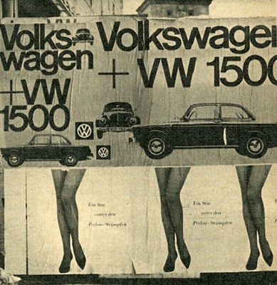
This is a VW poster for the 1967 Beetle and the 1962 Volkswagen. I felt that this was strong for my project as it stresses the purpose of my project and it helps show a strong link between the two different VW's. I really like the colour choices that have been used and I also like how they have been designed and positioned, the two posters reflect one another and there is a really effective hierarchy. They look very crisp, clean and eye catching and the use of space in them makes them visually appealing.

I included this image because I love the strength of the colours in this image and how it has been shot, composed and edited. I feel that it shows the relaxed and busy aspects of motoring and that the Camper can handle and that it is in its environment in which it was purposely built for. I feel imagery photographed in this way will link the pages and content in my brochure together successfully and it will help break up the text and work well with the space.

This is another advert for VW, I really like the use of a black and white format and how this advert has been composed. It has a strong and clear hierarchy and it relates in with the theme of VW's other adverts.
The image of the beetle is very striking and it stands out which connects with the audience.

I screen printed this image because I felt that it was very appropriate research for my the purpose of my brochure. It shows images and dates of the VW Beetles that they have designed and produced over the years, I also like the style of the image itself, I like the black and white theme as this adds ageing and time to the imagery.
I feel the style of this image would be suitable for the style that I want to try and achieve in my brochure design, I like the composition of the image and the simplicity of it. The antique colouring on the image is the theme and feel that I want to achieve in my brochure, especially at the beginning of the brochure where I explore the very first VW's that were produced as this will reflect the time and ageing process of the car through its development.

The top image I feel is quite effective as it uses subjects which interact with the Camper Van, I feel this adds more interest in the imagery and relates to a topic or theme.

This is a VW advert, I really like the style and the range of their adverts as they are simple and clean in appearance. They use witty tag lines with their imagery which reflects a lot of the personality of VW. I feel I could include a range of adverts which VW have produced within my brochure as this will show not only how the cars have developed through time, but also how their adverts have developed too.

I love this photography as it is very clean, sharp and crisp, I feel I could include aspects of this style of photography within my brochure to help break up the antique, aged feel, it will also be a strong connection between the old and the new.

I like the simplicity of this advert and the tag lines that they play on, this is really strong for VW as it makes them stand out and create a strong range across their adverts which interact with the audience effectively and it has helped create a strong brand identity.

I really like the effect on this image, this is the feel and appearance that I want my images in my brochure to have, I feel if I create a range of images produced in this style, it will definitely create a strong identity for my project and create an effective style which I can work from and throughout my project which will connect with the target audience.