Wednesday 25 May 2011

Bibliography


Bibliography for ‘A Bug’s Life’

Below, is a list of websites that I have used for and throughout with my project.
I will list them in sections –
·       Research / Imagery
·       Artists
·       Content

Research / Imagery
http://www.vwcamperandbus.com/
http://www.thetruthaboutcars.com/2008/12/review-used-car-classic-vw-beetle/
http://en.wikipedia.org/wiki/Volkswagen 
http://en.wikipedia.org/wiki/Vw_beetle
http://www.volksworld.com/
http://www.youtube.com/watch?v=-NGN4J6F_vI&feature=player_embedded
http://www.youtube.com/watch?v=tQbn6UAV3Jo&feature=player_embedded
http://www.facebook.com/vwcanada
http://www.facebook.com/pages/VW-Bus/41013959589)
http://www.youtube.com/watch?v=4rb8aOzy9t4&feature=player_embedded
http://www.youtube.com/watch?v=s13dLaTIHSg&feature=player_embedded
http://www.dafont.com/ 
http://www.fovia.net/office/commercial.php 
http://www.amazon.co.uk/24th-Special-Volkswagon-Beetle-1973/dp/B0007XXKQ6/ref=pd_rhf_p_t_1
http://www.fansofvans.com/2009/08/vw-camper-van-wallpapers.html
http://www.vwcampervanblog.com/20-awesome-vw-camper-van-photos-from-my-photo-library/
http://www.google.co.uk/imgres?imgurl=http://www.littleredbook.cn/
http://www.google.co.uk/imgres?imgurl=http://2.bp.blogspot.com/_4RHGHnd4sIw/RZrLYtl_
 http://www.magmaweb.com/vwmarketplace/misc.html
http://www.smashingmagazine.com/2009/04/21/creative-print-typography-layouts/
http://www.smashingmagazine.com/2008/10/26/retro-and-vintage-typography-showcase/
http://www.topspeed.com/cars/volkswagen/2005-volkswagen-beetle-cabriolet-dark-flint-ar948/picture16485.html
http://www.californiaclassix.com/Bernard/Keefer.html
http://www.vintageadsandstuff.com/adsautovwbug.html
http://www.ratrodbikes.com/forum/viewtopic.php?f=6&t=30255
http://uk.cars.yahoo.com/19042011/36/brand-new-beetle-crawls-0.html
http://www.kdf-wagen.de/lcode/index.php?cat=5

Artists
http://www.owendavey.com/
http://chris-boyce.com/
http://mrkwvr.com/
http://www.paulsmith.co.uk/shop/home/
http://www.heartagency.com/artist/LauraCarlin/gallery/1

Content
Volkswagen Beetle – Haynes Manual – Jonathan Harvey
http://www.convictedartist.com/volkswagens.html
http://www.volkswagen.co.uk/volkswagen-world/heritage/timeline
http://www.netcarshow.com/volkswagen/1938-beetle/
http://www.edmunds.com/volkswagen/new-beetle/history.html
http://uk.cars.yahoo.com/19042011/36/brand-new-beetle-crawls-0.html

'A Bug's Life' and me

‘A Bug’s Life’ and me

At the beginning of this project, I was undecided as what I wanted to do for my FMP. Originally, I knew I wanted to use InDesign in my FMP as I really enjoyed the ‘Double Page Spread’ project in year one, I also really enjoyed my recent project  ‘Channel X’, as I loved the fact that it was about cars and I really got into the project and the visual graphics aspects of the project. I also have a goal to work for the Top Gear magazine, combining the my two favourite projects together, therefore I felt that designing a car related document would be appropriate for my FMP and mould keep me influenced and motivated throughout.

When I first got into the project and realized the amount of work that was needed with the designing of my book, I lost confidence and motivation in myself and was considering changing the project to something else, but with very little time left, I felt that this would be a mistake. I found my motivation again when I visited the Santa Pod Raceway ‘Big Bang’ show as I was gathering information and imagery on the Beetles, I mainly found my strongest motivator in Volkswagen, as they recently broadcast the launch of their new 2012 Beetle, I felt this would be a great market for launching my book as the publicity from Volkswagen would bring out the Beetle audiences and people will want to see the changes from the older designs through to the current release.

I found some pages in my book really fun to put together and position objects on them as they worked strongly and flowed well from other pages and were suitable for the target audience. I really enjoyed designing the first few opening pages as I feel that they look very elegant and strong and make the book look very professional and attract the target audience into the book. However, I found other pages more complex and difficult to design as there were a lack of high quality images and sufficient information for me to use, I found also that these pages were hard to make them stand out and look different from previous pages, I found that the pages started to blend and merge into similar page layouts and colour schemes.

Overall, I am really happy with my final outcomes, I feel that it looks very sophisticated, reflects the meaning and personality of the Beetle in and throughout my book which the audience will be able to see and relate to, I have ensured that the design of each DPS is strong and appropriate for the target audience and I feel that my content is also suitable for telling the life of the bug, but is also easy for the audience to read without being overpowered with detail.

Chelsea Nelms

Tuesday 24 May 2011

Evaluation of 'A Bug's Life' Project

Evaluation of Final Major Project

‘A Bug’s Life’

This is my final major project evaluation on my book called ‘A Bug’s Life’.  The target audience that I have aimed the content and the design at is people who are Beetle enthusiasts or lovers of classical cars, I feel I f I had to put an age group on my target audience, it would be aimed at people aged 25+, I feel this age because it is a fun and retro car and would appeal to people around this age who would be able to afford one. The client of my project is Volkswagen Beetle and the intended message of my book is to inform and show the audience the life that a Beetle has under gone and how it got from where it originated up to where it is now in present day. The format of my design is going to be a hardcover book, approx. 24cm x 14.5cm in size and will be printed in full colour (CMYK).

My final design meets the required outcomes for the target audience as I have made sure that the content has been written in enough detail without it being to basic or overpowering, I have also ensured that my choice in images are strong, successful and would interest them in looking at the book, I also ensured that the layout and page design did not appear to simple and plain but did also not seem tacky, cheap and childish as this would turn my audience away from my product. It is very appropriate for the client as I have ensured my facts are correct from use of the Volkswagen website and an official timeline from Volkswagen, I have also used facts and quotes from their brochures and from a book dedicated to Beetles. It also shows the development and changes to Beetles in a positive way and would be suitable for them as it could support their new 2012 Beetle launch as I have included their important moments over the years and mention of the new Beetle, I feel that my book would strongly support and be appropriate for Volkswagen.
I meet the message of my project as the layout and chronological order of my book tells a story of beginning to current day, the content, imagery and style of the book with the change in appearance and feel of pages through the era’s and different styles, strongly shows the message of ‘A Bug’s Life’.

Through doing this project, I have advanced, learnt and taught myself new skills and techniques. In Illustrator, I learnt how to use Live Trace effectively and then apply Live Paint to my images, I really liked the effect and how it was such a simple technique to use, now that I have learnt this skill, I will be able to use it in more suitable future projects, where it works better and more successfully with the topic. I also learnt to use Photoshop in more depth, especially when cutting out images from their backgrounds and surroundings. I learnt to combine the magic wand tool with the lasso tool and using the plus and minus command keys to change the selection, I found that with this technique I could create a more cleaner and smoother final appearance and edge on my cut images. I feel where I have progressed the most is within InDesign, as I haven’t used this package much over the two years, after playing with the software, seeing what InDesign can do, create and achieve and with the help from online tutorials, I learnt the short cuts, how to use text wrap effectively, and apply drop shadows and feather effects, I felt that with these effects and techniques, that the overall appearance of my pages look very effective and finished to a high enough quality which is suitable for my target audience.

I have used a range of materials and media within this project; within my research I have been very experimental as I have tea and coffee stained different types of paper, such as kitchen roll, A3 plain paper and torn cartridge paper, I have also ripped and scrunched up the paper which has left me with some great textures that, when scanned and edited in Photoshop they work really well for my project and appear very grungy. I have also experimented with tracing paper and converting my drawings into digital media in Illustrator, I found this very effective and a great skill to have learnt. Media’s that I have used digitally also include the use of my own photography and enhancing and editing these using the different packages on the Apple Macs, I have also used the Photoshop filters and the drop shadows to enhance and make my images stand out further in my book.

For this project, I have researched and looked at a range of designers and artists as I had a range of ways in which I wanted to produce the appearance of my final outcome. I looked into the photographer Paul Smith as he produced a range of designer items and photographs for a special edition Mini Cooper. I also looked at artists Laura Carlin, Chris Boyce and Owen Davey, I really love their work and the styles and colours they use to produce their outcomes, in particular, my favourite is Owen Davey as his style of work is really fresh and innovative and I think in the future I will be able to gain a lot of influence from him. I have looked into the types of movements that was around during the different times of the content that is in my magazine, I especially looked into the 1998 Beetle year, as I needed to make that page really reflect the personality of this Beetle so I looked into retro designs.

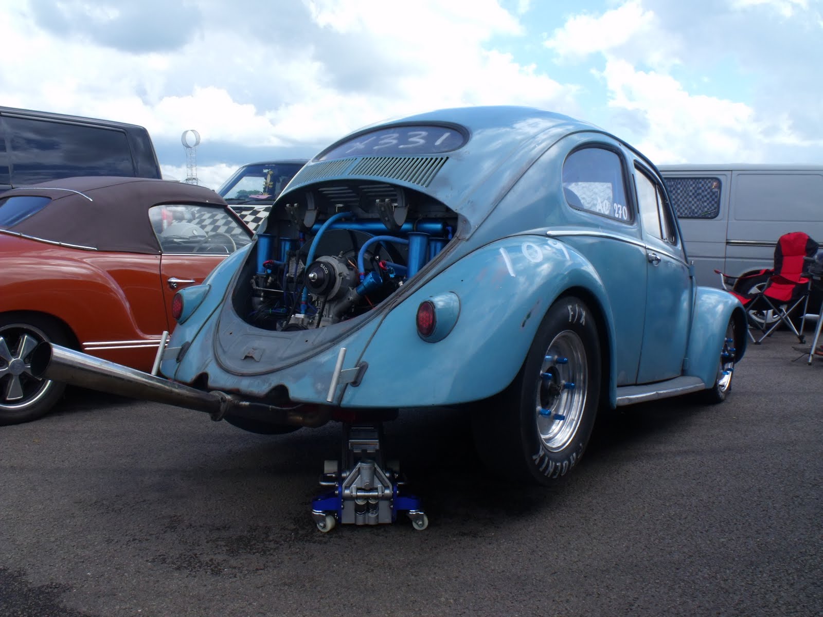
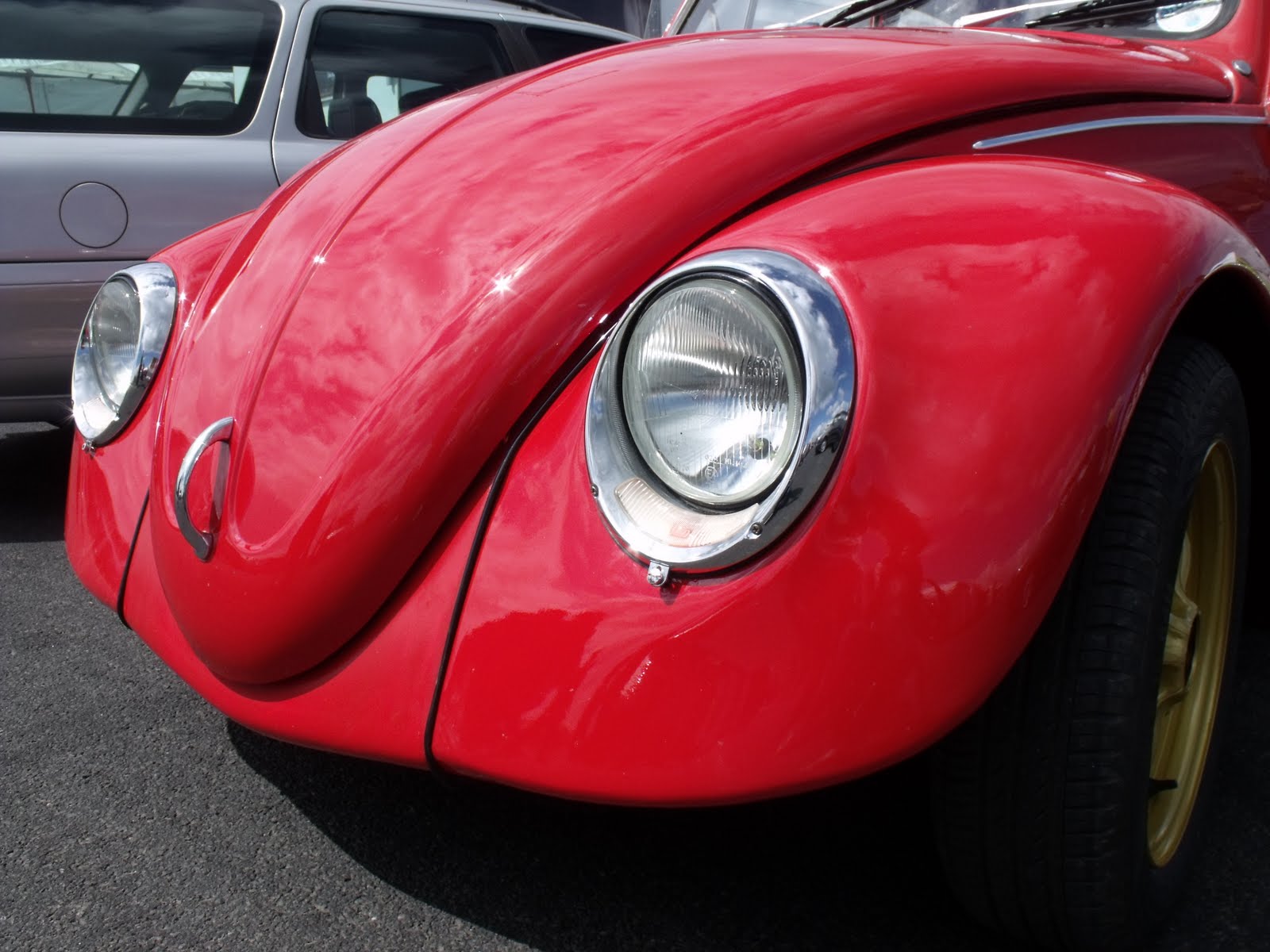
The form of research that my project has taken has varied as I have used a range of methods. Firstly, I had to start and use a blog continuously throughout this project, here I uploaded my original brief along with my initial research and I then progressed and developed this blog weekly by looking into different styles of photography and looks to design work, I then branched out and looked into Simon’s Cat, Haynes Manuals, Wallace and Gromit and a range of other influential designers and designs. With the use of a blog, it allowed me to include videos and be more creative with my research; therefore I included VW adverts as this gave me a feel of how they communicate with their target audience, their style of advertising and the age group that they are targeting. I also scanned a wide range and varied images from Beetle brochures - current and older brochures, a booklet about the Cabriolet and I liked how they connected with their audience by allowing them to interact with the advertising via acetate, Racing Legend booklet that I found quite useful with the consistency of the layout and I liked the black and white colour scheme to show the aged content. I also looked at typography styles, block printing and different methods that I could incorporate into my brochure. Alongside this blog, I also created a sketchbook, which reflects the contents of my blog, but it contains my design work and shows how I have used the research from off of my blog to help with the designing of my layouts. I have also included primary research by using my own photography from ‘Big Bang’ at Santa Pod Raceway, I feel that this has really strengthened my book design and appearance and my photos will appeal to my target audience.

The research has influenced my project as it has allowed me to create new ideas and techniques by looking at the design work from other people, the layouts have really helped me design my brochure pages as the positioning of things made me think about the hierarchy of each page, how I want my viewer to see and interact with the page, how I can get from the start to the finish of the book without an obvious visual appearance of the year change and the positioning of the items on the page. Also, the research regarding the content was very helpful as it gave me great information and it allowed me to restrict the quantity and focus on what I wanted to put into my book, which would be more suitable for the audience.

I have linked the research into my own work by showing in both my sketchbook and talking about it on my blog how I have used the work to influence my designs and in what way they have inspired me by using similar techniques, referring to a particular artist, style or technique and then showing my take on the design.

The things that I felt worked really well in my project has been the development and designing of my brochure, I really like the opening pages of my book with the typographic quote and the photography. I also feel that my photography from Santa Pod has strengthened my project and it
re-motivated me in my project, I also felt that the message behind my project is really strong as you can see it subtly in my book, changing through the years and I feel that it is a modern and fun way to review history.
I feel what didn’t work well was the idea of both a sketchbook and a blog as this made twice the amount of work and meant repetition between the two occurred, I found that with the blog it was great for quick research and using different ways to present your research with videos and to communicate with people, but it meant every time you wanted to refer to your research or design from it, you had to have the internet at hand to use it, I also feel that it is more effective to have a hard copy of work such as your sketchbook so that you can relate to it in the future and keep all of your work together in the same format.

I feel the most difficult parts in this project was deciding what to do my project on, whether it would be successful and be good enough standard for the exhibition. I found that writing the content from using a current Beetle book and the information from off of the Internet and then deciding what to include and talk about in my book was one of the hardest parts as it was time consuming and held me back a week against my time plan, I also found importing images that were of high enough quality into InDesign hard and frustrating, I thought designing some of the pages so that they looked and flowed effectively and would be appropriate for the target audience quite hard as the images I wanted to include related with the content but didn’t work well within the page layout or design.
The most straightforward parts of my project I feel were the working to the time plan and structuring my work, for the blog, sketchbook and FMP. I also found gathering the research and information on the artists was simple to do and then presenting this in my sketchbook was successful. The designing of certain pages in my book were very simple and easy to do as they worked and looked strong on the page for both the hierarchy and visual content.

I have structured my work from beginning through to end as I drew up a time plan of what I needed to do and by a set date or week, I also broke my time up into sections relating to the work which needed completing first and ensured that I completed it all before moving on to the next task. I planned what I was going to research and I then uploaded this chronologically onto my blog and into my sketchbook so that you can see my thinking process and how I got from one idea to another and my reasons for doing so.  Used my research and my own ideas of how I envisioned my book to look and then found and created the right materials and effects that I was after and applied these into InDesign to create my book.

If I were to do this project again, I feel I would create more experiments and show these in my book, I would have liked to have had some of my pages in my book interact with the audience more, such as tracing paper and acetate pages where images flip onto pages to create other images and to have different sized page sizes and to include my coffee paper pages, bound into the book, I also would have liked to have drawn up more illustrations and watercolours of the Beetles onto the stained paper so that I could use these in my book to strengthen the appearance. I didn’t improve it at the time by doing these things as I was unsure how to use InDesign to that strength and I didn’t know how to use the techniques so that they worked effectively, or find a printers who would be able to produce my book with the variation in pages.

By completing this assignment, I have developed my knowledge and skills by learning how to use InDesign and how effective and simple it is to create a book to your desired look, I have also thought about the costing and the different printed paper effects that you can get and how the pricing of printing a book will effect the price costing to the customer. I have more knowledge about the different packages and how the software works ion more depth by being more creative and experimental in them.

I feel I have met the learning outcomes successfully as I have ensured that my final book is appropriate to my target audience, the content appeals to them along with the visual appearance of my book, I have made sure that I have related back to my brief and my statement of intention and I feel that I have pushed myself with the design aspect of this project and I feel that ‘A Bug’s Life’ is a very successful product.

Chelsea Nelms

A Bug's Life - Finished Book and Pages

This is my finished book for A Bug's Life, I have developed and changed some of the pages from my development, I have also had to resize the height and width of my book so that it was suitable for the printers to use and print for me, I feel that at this size it looks a lot stronger and the pages work more effectively and is going to interact with my target audience more suitably.

A Bug's Life


I have had to add in an extra DPS as the printer will only print and bind for a 32 page document, therefore I included the last DPS, I gave it this design as it reflected the beginning of the book, I have used a straight solid line and it is simple. 


My final book at the exhibition held on the 14/06/2011


This is my exhibition stand and the chosen display layout that I chose to use, overall I was really happy with the final appearance and finish of both my book and exhibition.

Exhibition

My Final Major Project will be shown on the 14th June 2011 for one night, between finishing my project and handing it on the 31st May 2011, I will need to plan out and organise the appearance of my board and work for the exhibition.

I want my stand to have a certain appearance to it and within that time I will need to plan it around time so that everything is ready for the showing -

Time Plan

25th May - Order a VW Beetle off of Amazon (above is the image of the Beetle I will be ordering)
25th May - Print out a large VW template and ask the technician to make me one out of wood
31st May - Hand in Sketchbook
5th June - Sand and apply prima to my VW badge
6th June - Apply blue spray paint to VW badge
6th June - Take my book and posters to the printers
7th June - Collect my finished book and posters from printers
8th June - Paint my board white
8th June - Measure up for a shelf to be built
8th June - Mount work up on foam board
9th June - Mount VW Badge
10th June - Write up a short paragraph about my project

31st May - 14th June - Final Professional Print of  'A Bug's Life' on a plinth
14th June - 6pm - 8pm - Exhibition

Above is a rough, approximate time plan, it gives me an idea of what I need to have done and by when within the short time period.

I want my exhibition stand to consist of a VW badge mounted upon the wall alongside a selection of my four best DPS's which will all be mounted onto foam board.
I will place my final book on a plinth on the shelf alongside my VW Beetle car, I will also write up a paragraph about who I am, what the purpose of my project is and why I chose the topic.
I feel this will look simple yet sophisticated and it won't draw any attention away from my FMP, but it will make it stronger and emphasise what the purpose of my project was.

This is my drawn out VW badge onto wood, I will ask the technician to cut it out for me and then I will paint it, ready for mounting on my board.

THe technician cut it out for me, I then sanded it down until it was all smooth on each surface, I then sprayed it with Prima which will seal the wood for when I spray paint it.


I really like the finish of it with just the prima on as it has a matte finish which I feel reflects the style of my brochure and the VW strongly, also it will stand out strongly from the exhibition board, however I feel that spray painting it will make it stand out more effectively and give it a better finish.


I applied a couple of layers of blue spray paint, it looks really effective,bold and has a metallic finish and sheen to its appearance. This will look and work strongly from off of the white exhibition wall, I think that this will work well alongside my range of posters and final book.


These are my favourite two exhibition board layouts that I have drawn up in my sketchbook. I feel that I will use the one on the RHS as it is clearer and more compacted.

Development - A Bug's Life

For development of my pages of how I have improved and designed my pages, my sketchbook will include images of my pages, fully annotated - showing and talking about how I have changed them, why I have changed them and whether it has been successful.

Here, I will include screen shots of my current progress with the pages of my book - 24/05/11


Front Cover

(Not finished and undecided whether this imagery will be used, title needs to be included)


Opening Page

(Title page of book, my photography, typeface reflects entire book typeface choice, appearance of page is reflecting the aged to the modern in appearance and feel - grunge to shiny) 
(Page needs text positioning alteration)


Quote Page

(Reflection of the outline of a car with a powerful quote about Volkswagen Beetles - positivity and a simple, innovative page design) 
(Fully Finished Page)


Contents Page

(Simpel, effective, clear to read the titles of the pages and has a strong hierarchy, one of my strongest pages) 
(Fully Finished Page)


Introduction Page
(Quote about Volkswagen Beetles, strong hierarchy and aged appearance, feel that there might be too much space top RHS)
(Page needs re-looking at but is mainly finished)


History Page
(Specific imagery used - relates to text and draws the audience's eyes into the page, text wrap has been made along with appropriate drop shadows)
(Fully Finished Page)


Checklist Page
(Not all graphics have come through - hence the patchy areas) (I have used my experiment practicals and used them as sticky notes which hold the information on, this makes the bullet points visually more interesting to the audience and easier to read, created a layered up effect with appropriate imagery according to the text) 
(Fully Finished Page)


KdF Wagen Page
(I have used images which were used in a German newspaper from the time that the KdF Wagen was being built, the text is easy to read and is easy to move around and through the page, simple yet creative design and is starting to fade away the aged look)
(Fully Finished Page)


British Page
(This is one of my strongest pages I think, the imagery is strong, modern yet aged slightly in feel and appearance, makes good use of the space and has a strong hierarchy. Good use of my experiment scans and relates back to previous pages, strong use of text wrap and chosen typefaces)
(Fully Finished Page)


Heinz Nordhoff Page
(This page is still being produced and designed, I am having to design it so that it starts to look more modern and clean in visual design and I am trying to create a strong connection between images and text and to flow it between the pages so that it has a smooth transaction between the design changes)


Herbie Page
(This is one of my favourite pages as it is a strong contrast among the pages and looks very clean, crisp and fun, it reflects Herbie effectively and the content is easy to read and is suitable for my target audience and topic)
(Fully Finished Page)


1998 Beetle
(I love this page, I feel I have successfully captured the personality of this Beetle and have shown it well throughout the page, this page is going to connect with my audience, another quote for the Beetle, contrasts between the opening pages)
(Fully Finished Page)


Cabriolet Page
(With this page, I have used the pages as a mirror to mirror both the content and imagery, page flows on from the previous page strongly, also the page as a whole is strong and effective for the purpose of the book for change as the audience can compare the two right in front of them easily) 
(Fully FInished Page)


2012 Beetle
(Really strong DPS, crisp, clean imagery and execution of the page, great advertising for the new Beetle and relates really well to my book and overall project, inspire people for Beetles, mixture of modern with aged look, very subtle)
(Fully Finished Page)


Show Page
(Not all graphics have come through - hence missing graphic) (Textured page, text is clear to read, easily see the contrast between the two era's, my photography - contrast between opening and closing pages, I feel this is effective)
(Fully Finished Page)


Back Cover
(I'm undecided what to include on this page, I need to write up appropriate text about my book for the blurb and need to keep it very simple in design, plain background with above line drawings???)


Above are screen shots of my book so far in its development stages, there are far more images and more detail developments in my sketchbook
.
Some pages above are completely finished as I am really happy with how they appear and I feel that they relate to my target audience and communicate the message that I intend to put across and deliver. 
Other pages I feel are nearly there, but just need tweaking in areas to make them stronger and sit better visually on the page.

Other pages I need to completely finish and blend them in with the rest of the book design so that they are suitable.

Overall, I am really very happy with the appearance and the feel that I have created within my book, I feel that you can see the effect that I have produced throughout and I think it is very successful and will work with the target audience.


Sunday 8 May 2011

Big Bang - V Dubs 2011 - My Photography for FMP

For my project, I went to Santa Pod 2011 'Big Bang' I took a range of photos of different Beetles at different angles as I felt that I would include my own photography and wanted it to look strong and striking from the page to work alongside my text.


I took a picture of the mechanics as I thought that I could zoom in on the detail and the technical areas and use this at a low opacity as the background behind text to add texture and detail to the page.


I really like this image as it is visually very strong and I feel it would look really good on one DPS with bold text, it would make the page look strong and interesting and would be a strong way to open or close my book.


I like shots that have been taken like this as they draw the eye in and edited would work really well with text.


I love this image, it is really crisp and sharp and would work well with some flowing typography, I think it would work really well for my opening pages as it draws the eye in and sets the feel and tine of the book.


This is another image which I feel will be very appropriate for the style of my book, I could close the book off wit a photo also to show reflection and consistency from start to finish.


I like the reflection that I have captured in this image, I also like the curve of the Beetle and feel that I could edit this image by cutting out the Beetle and using it with text and text wrap.


I like the angle of these photos and with editing and cutting I feel they could make my page layouts look more effective.


I took a photo of this image as I could include DPS's of people who 'pimp' and change the appearance of their Beetles as this would engage with my audience on another level.