This post I have scanned in imagery that I feel is relevant for my brochure design and layout. I have included existing VW brochure layouts as I feel this is necessary so I can relate to VW's branding of their brochures so I can get an idea of how they present themselves and engage with the audience. I have also included some images of the types of visual elements that I wish to include within my brochure, the colour scheme styles that I want to achieve and the layout effects and textures.
These are four pages from the VW convertible brochure, their DPS's follow range of same structures and formats throughout their brochure. They use a big image going across 6 columns, this includes a high quality, large image across 5 columns and then a column of text which allows for a tagline, caption or information about the image and product they are trying to sell.
Other DPS's use images in boxes with thick white borders edging them off, surrounding a big image of the product, this creates a hierarchy which leads the eye into the page and looks visually interesting.
This was from a VW pricing magazine, I included this image because of the style of the drawings. This shows the different views of the car in plan, front and side views. I want to include imagery that is produced in this way so that it shows time and ageing and it adds visual interest and breaks up the imagery across the pages, I also feel it will be an innovative way to design some of the backgrounds of the pages and add texture.
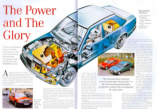
Mercedes Magazine
I scanned this because I liked the main image on the page, it has been produced in the style in which I want a VW Beetle to appear like in my brochure. I dislike the layout of this brochure though as it feels as if they have just tried to cram as much as possible over the DPS.
This is the front cover of the Porsche 924 brochure. I scanned this image in also because I liked the simplicity of the cover design, it's memorable and straight to the point. I feel this is too dull and simple to use on my front cover but I could use this as a starting point and develop my design.
I scanned these two images in from Pirate books because I like the background colour and the textures that are within the books themselves. I also like how they layer and arrange things, this makes the pages visually more appealing and it creates a better feel for the overall book design and ties in stronger with the theme as well as making it feel and look good quality for money.
Below are a selection of images that I have photographed from an Italian recipe and wine book which came through in the post.
It is a very well designed brochure and the layouts are innovative with strong, powerful imagery which works well against the chosen typography. The front and back covers have been printed onto cartridge paper which makes the cover harder and more protective, adds texture and it makes it more professional and of higher quality.
The choice of imagery reflects Italy and the types of meals that they prepare and it really engages with the audience and creates a strong positive atmosphere with Italy. The choice of typography is spaghetti like which is very appropriate with the theme of pasta and it helps the book flow and it works with the imagery, colour scheme, and the space created within the layout.
I feel that this book is going to be very influential of my brochure with the layout and the fact that it has been produced in a landscape orientation as it will give me a strong idea of how images and text work and look best across the DPS's.


