When I print my final major project, I want it to have a high standard finished appearance.
I went into Fovia in Bourne and spoke with the man who will print my book for me. I felt that I should find a local print house and work this in and around my time plan for my project.
For him to print my book I will need to take it in on a memory stick in PDF format and preferably in 'page spread' formats. It will cost me 75p for a page of A4 to be printed so it will work out relatively cheap for the production. There is no set amount of pages needed for my book to contain or a set amount of time for printing as he uses Duplex printing and will take about 6-8 minutes to print my book and to hold my book together it can be stapled or wire bound together. For the front cover I can have my design printed onto paper up to 300gsm.
Looking at my time plan, I am on week 6 and currently up to date with my plan, over the next 5 weeks I will produce and develop my VW Beetle book and on week 11 I will take it to Fovia's in-house printing shop and have it printed up ready for week 12 where my final piece will be put on display.
( http://www.fovia.net/office/commercial.php )
Wednesday, 30 March 2011
DaFont
This post explores the typefaces that I have looked into and the ones I feel that might be suitable for use within my brochure.
I will be using fonts from off of the website DaFont ( http://www.dafont.com/ ) as they offer a wide range of different fonts which are appropriate for any theme, feel or style of design that you are trying to produce.


I will be using fonts from off of the website DaFont ( http://www.dafont.com/ ) as they offer a wide range of different fonts which are appropriate for any theme, feel or style of design that you are trying to produce.

These are typeface choices which I have chosen out as I feel that these will or could work very suitably within my book for the headings, quotes and help with the page design and appearance.

These are typeface choices for the body text that I will use for the text throughout my book, I want a typeface that is simple, effective and works and contrasts against the heading and quote typeface choices.
Page Layout Design (Sketchbook)
This post shows a wide range of layout designs that I have created and drawn out in my sketchbook. Here, I can easily see which ones I feel are my strongest designs and develop them into more suitable outcomes for my brochure layout.


These are pages that I have drawn up specifically for each page, I used the positioning of text and imagery when I was creating the pages as I felt it worked successfully and I found that it made creating them on InDesign a lot easier and time effective. I have also talked about the content and how many words for each page I felt that there would be.


This was my initial idea for my front cover - to have sections of the different Beetle's from the different years and create one bug as an image, I felt that this would look effective and strong, however, when it came to choosing a front cover, it wasn't appropriate and didn't work for the theme and style of the rest of the book.

This is my above initial ideas put into design, I feel that it looks and works very strongly but is slightly to modern for my book.

This shows ideas for which orientation works better, portrait or landscape.


These pages were quick drawings of how many pages are going to be in my book and how I could lay the designs for the content out so that it flows from page one to the last page with an effective arrangement of images, text and white space.

This is a page of imagery that I felt I could use to place in between headings for the different pages, I feel that the idea is effective but it isn't suitable for my book style.

This is an image of my lino cut which I drew onto to produce prints for my experiments.
A Bug's Life - My Book
Content
I have written the content of my book out by using information from the book "Volkswagen Beetle" By Jonathan Harvey (Haynes Enthusiast Guide), this has given me a structure to work with, how I am going to set my book out and what information and topics I want to talk about to engage with my audience. I read through the book and broke down the information into simpler terms to understand and relate to and I shortened my content so that it would give me more space to work with on the designing of my pages.
I also used many references from off of the Internet and used my "Useful Link" websites as this gave me great information about the different Beetles and the years they were designed in.
For the quotes which I have included within my book, I have used these from Beetle brochures that I have, I read through the information and highlighted upon the important parts and made these into quotes which I will use to make my pages stand out more and to make the text of more interest for the reader.
Below is the content of my book, I will add in more relevant quotes and I will edit areas of text which I feel need rewording or need taking out:
Structure
The structure of the book is going to follow a set format -
Double Page Spreads -
Imagery
From my blog, I have found some images which will be suitable to use within my book, I feel that I will further this research on to find stronger images that are better suited for my book as when I'm designing, ideas from the content and design process will influence me and make me be more creative and specific with the imagery I use. I intent to use my experiments throughout as these have been the main focus for the visual content of my book and feel that I will be able to use these creatively and in different ways and processes as I progress through the range of eras that I will be covering.


I have written the content of my book out by using information from the book "Volkswagen Beetle" By Jonathan Harvey (Haynes Enthusiast Guide), this has given me a structure to work with, how I am going to set my book out and what information and topics I want to talk about to engage with my audience. I read through the book and broke down the information into simpler terms to understand and relate to and I shortened my content so that it would give me more space to work with on the designing of my pages.
I also used many references from off of the Internet and used my "Useful Link" websites as this gave me great information about the different Beetles and the years they were designed in.
For the quotes which I have included within my book, I have used these from Beetle brochures that I have, I read through the information and highlighted upon the important parts and made these into quotes which I will use to make my pages stand out more and to make the text of more interest for the reader.
Below is the content of my book, I will add in more relevant quotes and I will edit areas of text which I feel need rewording or need taking out:
The Content of A Bug’s Life
Introduction
Let’s face it, there is only one word that comes to mind that truly describes a Volkswagen Beetle – legend! It is the definitive motoring icon, which consistently ranks as one of the greatest cars of all time. Its instantly recognizable shape and simple mechanics alongside a stubborn refusal to wear out have endeared the Beetle to many millions around the world, not least the two and a half million people who bought one new.
A Bug’s Life unearths the development and production history of the Beetle, from its Hitler inspired birth through difficult early production under British military control and then its rise to worldwide fame under the leadership of Heinz Nordhoff.
The final German made cars rolled off the line in 1978, but Beetle are talked about from the early splits and ovals to later models with styling retouches, more powerful engines and revised suspension arrangements.
Last but not least, there is a dedicated chapter to all the Beetle enthusiasts out there along with a listing of regular Beetle shows.
This is the life of a bug!
History
The life of a Beetle is a fascinating one, its first ten years as a design, prototype and victim of war, logically it should not have survived, but then with the determination from one man brought the Beetle to life which was successful for twenty years and became of major interest to the public. The Volkswagen Beetle is a legend and is one of the greatest cars of all time.
The origins of the Beetle are entangled with the rise to power of Adolf Hitler and his Nazi henchmen. For Hitler, motorcars always held a fascination, so much so that in 1923 he spent a large proportion of their funds on a large, expensive 60bhp Mercedes limousine. Hitler’s determination to push Germany forward was at the 1933 Berlin motor show, one of his first actions as chancellor, he demanded that the German automobile industry built him a small car for the people.
Ferdinand Porsche must have been one for whom Hitler’s words had special interest for he was one who had many attempts to produce a people’s car.
Hitler made it clear that his only interest was in a four wheel drive, front mounted, air cooled diesel engine vehicle to be sold at a price fewer that 1,000 Reichmarks. Porsche was shocked at the strict and precise practicalities, but nevertheless was keen to take on the challenge. Ferdinand designed an initial idea of what the car should look like and showed these to Hitler; Hitler was displeased with the design and penned a more rounded shape onto a napkin with the instructions “it should look like a beetle, you only have to look to nature to find out what true streamlining is”.
Checklist
Porsche’s definition of a people’s car:
“ 1. A Volkswagen should not be a small car whose dimensions are reduced at the expense of both handling and life expectancy, while it remains relatively heavy. Instead, it should be a functional car of standard dimensions but comparatively low weight, an objective that can be achieved by fundamentally new processes.
2. A Volkswagen should not be a small car with limited power at the expense of maximum speed and good climbing ability, but rather a practical vehicle with the necessary power to achieve normal maximum speeds and climbing capabilities.
3. A Volkswagen should not be a small car with reduced passenger space at the expense of comfort, but instead it should be a fully functional vehicle with normal, or rather comfortable, space within the bodywork.
4. A Volkswagen should not be a vehicle with limited uses, but instead should be capable of fulfilling all conceivable purposes by simply exchanging the bodywork, for use not only as a passenger car but also as a commercial vehicle and for certain military purposes.
5. A Volkswagen should not be fitted with unnecessarily complicated equipment requiring increased servicing, but should rather be a vehicle with as far as possible simple and foolproof equipment, reducing servicing to an absolute minimum.”
Strength Through Joy
The project car was named the Type 60 and was based around the early Type 32 NSU, which featured Beetle like styling.
Late 1935 the first prototypes were on the autobahns, a V1 Saloon (Sedan) and a convertible V2 (cabriolet), these cars had aluminum bodies mounted over traditional wooden frameworks. Daimler Benz made thirty prototypes but were not keen to make such a cheap car as they thought it would damage their high-class reputation.
In 1938, Hitler laid the cornerstone of the new factory called the KdF factory; it was here that the model would be known as the ‘KdF Wagen’ or ‘strength through joy’ wagen, this factory became and still is the biggest car factor of automobiles in the world. The production in September 1939 turned out to be the same month World War II was declared and the thousands who had their stamps from Hitler’s stamp car scheme never received their Beetles.
The war gathered pace so the KdF wagen was put on hold and production of the Beetle changed to military vehicles, this had much importance for the future of the Beetle as it had to sustain the hardest test which no other car had ever been submitted to before, it had to endure climatic conditions from sweltering Africa to icy Russia and in any sort of terrain such as mud, snow and sand, the Beetle never stopped. Due to this weather and ground type the Kubelwagen and the Schwimmiwagen were built.
British
After the Second World War, Hitler committed suicide in 1945 and the task was then to rebuild Germany. The country was divided into quarters and the KdF factory fell into the hands of the British and was under the management of Major Ivan Hirst where mass production of the Beetle started, he arrived at the factory and was ordered to take control, it was his belief and cleverness that ensured the Beetle’s survival, the factory was renamed and known as the Wolfsburg Motor Works. Whilst under the control of the British, two of the most ‘special’ cars, which were developed, was the ‘Radclyffe Roadster’ a two-seater roadster and a four-seater convertible, which was the personal transport to Ivan Hirst.
While it appeared that the British intended to run Volkswagen until further notice it was not Hirst’s decision to make, Hirst noted that ‘some people wanted me to fly a British flag over the plant! I said, “No, it’s not war booty. It doesn’t belong to the British.”’ With Heinz Nordhoff’s appointment in January 1948, Britain’s part in the Beetle story was more or less over, come September 1949 saw the hand official handover from the British Military Government to Heinz Nordhoff.
Heinz Nordhoff
Heinz Nordhoff ruled Volkswagen for a little over 20 years, after initial reservations, for his own words ‘the Volkswagen has more flaws than a dog has fleas’ he became the Beetle’s greatest supporter, its supreme ambassador and as the years went by, its most powerful defender.
Nordhoff says that ‘the car itself was “full of bugs” and it really was what you’d call an “ugly duckling”, I should change the name, design and everything about the car, weak points in the car had to be ironed out, material, quality control and personnel had to be solved and above all there was no sales organization.”
Nordhoff rose above all of these points and focused solely on Volkswagen and the audience that would be buying the Beetle, he goes on to say “So I have decided to stick to the policy that has served us so well. Based on Professor Porshe’s original design, the Volkswagen of today looks almost exactly like the prototype model that was produced more than 20 years ago, but every single part of this car has been refined and improved over the years – these will continue to be our “model changes.”’
Herbie
Herbie is known worldwide and is one of the most strongly associated Beetles with Volkswagen. He was born in 1963 in Germany and was an ivory coloured Volkswagen Beetle Type 1, he was famously distinguished by red, white and blue racing stripes and that big racing number 53.
In most of the Herbie movies, Herbie was a racing Beetle who had a mind of his own and was capable of driving himself and acted and moved on his own accord, but did not necessarily ‘talk’ with people. He could drive unlike any other race car driver could and he often executed unbelievable antics such as driving on ceilings, walls and jumping over or on top of other cars.
Herbie was also different from other cars as he fell in love, which we can see portrayed in his movies when he fell in love with a Lancia Monte Carlo and even a New Beetle. Herbie’s original film was called ‘The Love Bug” released in 1968, this was then followed by a series of other comedy films such as “Herbie Rides Again” and “Herbie Goes Bananas” along with many other films. The latest film released from Disney was in 2005, “Herbie: Fully Loaded”.
New Beetle – 1998
‘We all have dreams. Our dream was to capture the spirit of the old Beetle – its unique shape, its large smile and lovable character – and turn it into a new reality’
In 1998, Volkswagen launched the New Beetle, which caused immense interest with the public; the exterior design was inspired from the shape and appearance of the original Beetle along with the name.
The New Beetle was the car that started the retro-futurist design craze; it was a modernized version of the legendary VW Beetle and it connected with the consumers who had grown tired of the same standard car designs and had fond memories of the “Bugs” from popular culture. Volkswagen had made strenuous efforts to retain the retro spirit of the Bug, which had long been a cult classic helped by a series of Disney films featuring Herbie. However, this modern take on the original Beetle, which was far simpler in design, was prone to several mechanical and electrical faults.
Cabriolet 1949 – 2004
‘This exceptional car, really is the stuff of dreams’
The original Beetle Cabriolet began production in 1949 by Karmann, he bought a VW Beetle limousine and converted it into a four-seated convertible and presented it successfully in Wolfsburg where it started production shortly afterwards.
‘Life looks brighter with the hood down’
In 2004, Volkswagen used the body of the New Beetle and basically removed the hood and transformed it into a convertible, which was massively successful with the public.
“More Power, Less Flower’’ 2012
Volkswagen has unveiled there third incarnation of one of the world’s best selling cars, the Beetle and within no time at all, people were gushing about its bold and dynamic makeover.
The 2012 Beetle hopes to regain the luster of the iconic Beetle brand that remains one of the best-known auto brands by appealing to more men by aiming to shed the ‘chick car’ label. The designer claims that this Beetle is now characterized by a clean, self-confident and dominant sportiness and is a vehicle, which is sporty, dynamic and masculine. It is wider, lower and longer, it is sleek, slightly flatter and has still retained the cartoonish, triple bubble lines from the 1998 Beetle.
On April 18th, 2011, Volkswagen and MTV World Stage joined together to unveil the 2012 Beetle with a series of exclusive musical events, one of the most anticipated reveals in automotive history turned out to be one of the most entertaining parties in automotive history.
The structure of the book is going to follow a set format -
Double Page Spreads -
- Front Cover
- Quote
- Title of book
- Contents
- Introduction
- History
- Porsche's Checklist
- Strength Through Joy
- The British
- Heinz Nordhoff
- Herbie
- 1998 Beetle
- Beetle Cabriolet's
- 2012 Beetle
- Beetle Shows
- Back Cover
This is a rough guide of the structure of my book, the pages will include images of the specific book that is being talked about and will include a small amount of information to support the year of the Beetle. There will be pages that will break up the quantity of information and engage with the audience more and make it more visually interesting.
The pages will have experimental and grunge typefaces which will work with the body text and images and create a layered effect, I want the appearance to look very grungy and rough and use the white space that is available so that it makes it look strong and allows for the audience to move through the book easily and creates a constant flow through the book.
I want there to be a time changing feeling throughout my book, so that the book develops at the same rate that the Beetle changes. I will start the book off feeling very grungy and run down in appearance and use appropriate typefaces that reflect the era, I will then gradually fade the aged appearance out but not entirely and start to bring in modern and fun lively shapes and bold colours and make the layouts of the pages more fun and suitable to the content. I feel that this will look and work successfully and it will connect with my audience really effectively and won't be an obvious change nor will it be subtle.
I want there to be a time changing feeling throughout my book, so that the book develops at the same rate that the Beetle changes. I will start the book off feeling very grungy and run down in appearance and use appropriate typefaces that reflect the era, I will then gradually fade the aged appearance out but not entirely and start to bring in modern and fun lively shapes and bold colours and make the layouts of the pages more fun and suitable to the content. I feel that this will look and work successfully and it will connect with my audience really effectively and won't be an obvious change nor will it be subtle.
Imagery
From my blog, I have found some images which will be suitable to use within my book, I feel that I will further this research on to find stronger images that are better suited for my book as when I'm designing, ideas from the content and design process will influence me and make me be more creative and specific with the imagery I use. I intent to use my experiments throughout as these have been the main focus for the visual content of my book and feel that I will be able to use these creatively and in different ways and processes as I progress through the range of eras that I will be covering.
My Experiments


These are my experiments that I produced, I will use these throughout my entire book as they will be the backgrounds to the pages, they will appear strongly and more noticeable at the start of my book but towards the end they will fade out and more modern shapes and techniques will be used
Final Proposal - It's a Bugs Life
Through doing this blog and researching into all areas of my original design proposal, I have decided that I need to change my original design proposal because looking at the quantity of work that I have decided I need and want to do for my final project, I feel that I will be compromising the quality of the finish and within the timescale, I feel that my work won't be of a high enough standard. I need to put all of my effort into one of the two book designs so that I create a more successful outcome that is professional and suitable for my target audience.

The Target Audience
Through the research that I have looked into, the target audience of my book is aimed at people who are car enthusiasts especially those people who favor classic cars. The purpose of this book is to engage with the reader and to show them of the developments and changes of a well loved classic car.
This book is a one off and could work alongside the Top Gear magazine, Classic Car magazine and a series of other car magazines where they could have this inside of a special edition magazine and whether you are a subscriber to the magazine. I feel this would support the magazine in the fact that they release special edition books for their readers, make people more interested and increase the magazines sales and it will make the buyer feel like they are getting value for their money.
This book could become a series and produce a range of books for different cars and styles of cars so that it appeals to a range of target audiences and it could become a monthly release, it could be a new take on magazines but with a more specific focus.
the final proposal
For my final major project I am going to produce a book on the Volkswagen Beetle, which is going to talk and show the development of the Beetles over the years. The title of my project will be called “It’s a Bugs Life” I feel this is very suitable as it relates to the content of the book, will engage my target audience and it will create the overall feel that I want the book to give out. The proposed end point for my project is going to be a professionally finished book, which will successfully show the life and changes of the classic VW Beetle through the years, I will create a DPS for each of the Beetles which has been designed and I will break these pages up with pages of typography and print making based content which will be of relevance to my book. This project will extend my knowledge and design ability, as it will challenge me to be creative within the software and allow me to use my own existing imagery and passion for cars to motivate me throughout this project.
The influences and starting points for my project will be using book and magazine articles which I have collected over the years, I can look at the layout designs of each of these and the styles and techniques that they use. I will go to Santa Pod Raceway and other related events to collect research of images and flyers to help influence my project. Alongside this, I will research on the Internet into forums and websites that have been specifically designed for VW Beetles and use people’s opinions and thoughts on the cars.
Techniques that I intend to use will be editing my photos in Photoshop so that they are more suitable for use in my book and will work with the text content more effectively and create a strong hierarchy that looks innovative. I will be experimental with my layout designs within InDesign and use striking fonts that are going to be appropriate for my project and images. I want to create pages that are going to be textured therefore I will produce this by creating a range of experiments within my sketchbook and use lino printing techniques, tea staining and cut out print making.
I will analyse and review my work critically by the use of annotation throughout all of my work stating whether I feel it is successful, communicates with the target audience and how I can use it to help influence my project. I will ask for people’s opinions and use their feedback to help develop and improve my project. To conclude my project, I will produce a written document, which will state how I feel my project went overall, what I could’ve done to improve it and whether the final outcome is suitable for my target audience.
Chelsea Nelms
This is my time scale plan that I have created and I will use to reference and work my project to within each block so that it ensures I hit each deadline and target every week.
The Target Audience
Through the research that I have looked into, the target audience of my book is aimed at people who are car enthusiasts especially those people who favor classic cars. The purpose of this book is to engage with the reader and to show them of the developments and changes of a well loved classic car.
This book is a one off and could work alongside the Top Gear magazine, Classic Car magazine and a series of other car magazines where they could have this inside of a special edition magazine and whether you are a subscriber to the magazine. I feel this would support the magazine in the fact that they release special edition books for their readers, make people more interested and increase the magazines sales and it will make the buyer feel like they are getting value for their money.
This book could become a series and produce a range of books for different cars and styles of cars so that it appeals to a range of target audiences and it could become a monthly release, it could be a new take on magazines but with a more specific focus.
The Target Audience - Revisited
This is a one off special edition book; it is targeted towards Beetle enthusiasts and lovers of the classical cars. The purpose of this book that I want to achieve is to engage with the reader to show them how the development of the Beetle has changed through years and how the society and era’s develop and impact upon the way people design, both physically in design and mechanically in design.
I want my audience to see how the well-known and loved Beetle has changed through and over the years, but also how the modern Beetles are still influenced by the older and original designs and how modern techniques and processes are not always as successful as they were back in the day.
In my book design I will ensure that the content will be kept as simple as possible with the main important facts so that the audience can interpret the information easily without being overpowered, in a format that is fun and innovative in page designs and layout. Targeting and capturing the style of my audience is what is going to make my book successful and work well with the public.
Artist Influences
This post talks about and shows the works of artists, illustrators and photographers in whose work has caught my eye and I feel that their designs and creative methods will influence my project and help strengthen my designs.
Owen Davey
He graduated with a BA(Hons) in Illustration and started a career in Freelance Illustration, he works closely with Chris Boyce.
Davey has produced a range of successful pieces including his debut Children's Book, Foxly's Feast and has created work for Britain, America, Australia, Germany and Russia.
Davey is an illustrator, to whom I love his work and designs that he has produced and after looking through his portfolio of work, I think that his style will definitely blend in with my original design of what I want my brochure to look like and will improve and make me push my design abilities further and will also help bring and apply the modern twist into my brochure.

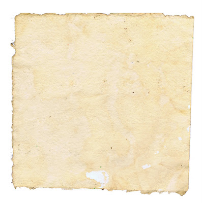
I like the run down and mottled effect of the background and how it has been applied to the images on top of it. I want some of my pages and images to have effects like this applied to them as I feel it is really effective and shows an effective aged appearance and creates a style which I think will be very appealing.
- - -


- - -
This is an image of a magazine spread that he designed. I love the colour scheme and the techniques he uses and how he communicates with the audience. I really like how he has the layout of his magazine as it is very relaxed and free on the page, I feel it is quite effective and would be a suitable style and layout for a DPS in my brochure.

I love this image and I think I will create a design in this way which uses a vector of a VW Beetle in the same way and then apply onto the background I have found in previous research.

I included this image because I liked how the shape of the map has been created into an animal and it made me think about how I could use the outline of a Beetle and fill it with lines and designs to make it more visually appealing and interesting to the audience.

I like the idea behind this design and the way it has been pieced together and the white space makes it clear to move around. I could create a range of different coloured Beetles and produce them in this layout, I could make it more powerful by designing one for each year of the development that the Beetle went through and include the date along with it too.

I could produce the same style and idea from the design above.

I included this image of the bull because I like the grunge appearance that it has and how the colour makes it very strong and sets the feel on it. This will influence me to produce a VW Beetle in this very same way and colour effects as I think it will look very strong and will stand out from my DPS's. I will include typography with the image as this will definitely strengthen it and make it more interesting to look at and it will help feed it in with the body text.

I love the layout of this DPS as the typography is effective and it works and leads the eye into the follow on page. I feel that the body text layout could be more experimental as it's rather boring with the layout, I think that Davey could've designed it so that it went over onto the second page. I love the big image and the style that it has been produced in, I could definitely use this to influence the design and layout for the opening page of stories within my brochure.
Chris Boyce
This section is on illustrator Chris Boyce who is friends with and works closely with Owen Davey. I feel that the style of some of his work is going to influence the content and how I present it in my brochure and make it appeal to the audience.

I love this T-shirt design, as the use of the dotted line pointing to the silhouette is fun and simple, it made me think about using this technique with the Beetle and having vector images coming off from the Bug and showing what the parts are, or what goes on that certain area or to create a range of Beetles in this way to show how they have developed over time visually.
- - -


- - -
I love these three images because I like the layouts of them and the style in which they have been produced. They look very clean due to the space around them and they are very simple designs which makes them quite strong.

I love the hand drawn feel and effect that you get from this image
Mark Weaver
Mark Weaver has also worked with Chris Boyce and I feel that his designs are simple yet very effective and clever how he communicates a message in them and forces it upon the audience. I love his DPS layouts as these are really strong and the will influence me with my layout design.
- - -


- - -
For both these pieces, I like the use of text over an image as it makes the audience look further into the design, I also like how the words associate themselves with the image as this creates a strong connection between the two. I think this could be a creative way to break up the quantity of text and information within the brochure by including a few pages with artwork on.
- - -
Below are a series of DPS's that I think are very strong and the layouts of them are effective and I feel will be useful when it comes to designing and organizing my brochure content.


These are very strong and I think that the way that the imagery connects and works alongside the text is one of the strongest layouts I have researched into throughout this blog. I love the strength of the colours and how he has incorporated a very strong perspective into the pages. I think I could take elements from his designs and layouts to influence how I present my pages, but I feel that they are probably to crowded and busy which will result in it looking weak and as if I'm trying to cram everything into one space.
- - -
- - -


- - -
These series of designs that he has produced I feel are very effective and have an 'off the wall' feel to them. I like how there is a mixture of photography with vectors and geometric shapes and how he has merged many layers together to create very strong and visual pieces. I included these images because I liked the simple layout of each of them and I felt that this could influence my layouts.
Paul Smith
Paul Smith is an English fashion designer who is commercially successful and highly respected within the fashion industry.
I feel that Paul Smith's work on the mini imagery and how he has applied this image to a selection of materials and formats would help influence my project due to the appearance of the mini and how it is very modern and sophisticated.
I love his design style and overall finishing of pieces of work as they are produced to a very high standard and they strongly engage with the target audience and are very contemporary and modern.


Paul Smith

I like how he has designed this as it is fun to look at and it leads the eye on a journey around the image. This style of design made me think about how I will connect the DPS's together and how I can make the audiences eyes move through the pages easily and smoothly. I think I could include the dotted lines to run across each of my DPS's, if I create them effectively I can link them in and behind imagery and text and it could also act as a timeline.
- - -


- - -
These are glass bottle designs that Paul Smith has designed. I really like the typography and the positioning and leading used on his cologne bottle, it is creative and interesting.
I also love the design he has created on the Evian bottle and the shape of the bottle. It looks very sleek and makes the audience want to buy them because they look very collectable.
- - -


- - -
These are two T-shirt designs designed by Paul Smith, I really like the style of design that he has used on them. The typography he has used to create the elephant is clear and strong, I really like the size variations he has used to create shadow, movement and perspective elements in the design. I love the small blocked section of colour he has included as this draws the viewers eye into the designer and the name of the design.
I could use these two styles of designs by creating a VW Beetle out of clean typography and I could create a vector of the Beetle and apply textures onto the top of it. I think that these can influence the designs for my brochure pages quite effectively.
I could use these two styles of designs by creating a VW Beetle out of clean typography and I could create a vector of the Beetle and apply textures onto the top of it. I think that these can influence the designs for my brochure pages quite effectively.
The Mini
This section focuses in on the special limited edition mini which he produced to celebrate the Mini's 50th anniversary and to coincide with 'Shopping Week'. The mini was shown to the public in October 2009. I feel that the designs and appearance of the mini is very successful and I feel that it is relevant to and for my project because I could create similar effects for the VW Beetle as I feel that it would be successful and engage with the target audience.
This section focuses in on the special limited edition mini which he produced to celebrate the Mini's 50th anniversary and to coincide with 'Shopping Week'. The mini was shown to the public in October 2009. I feel that the designs and appearance of the mini is very successful and I feel that it is relevant to and for my project because I could create similar effects for the VW Beetle as I feel that it would be successful and engage with the target audience.

I like how the paint on this is very washed out and run down as it still looks and feels modern yet at the same time shows signs of aging.

I really like these as I think they are fun, modern and an effective design. They made me think how I could transfer this style of design and relate it to the presentation of a VW. I could create a vector image similar to this in the shape of a Beetle.
- - -


- - -
These are images of Paul Smith's Mini that he designed. It is fun, colourful and has a lot of attitude and personality.

I love this wallet design, the texture of it is really strong and works well with the mini. I like the style of it and how it links modern design of the mini in with an aged effect.
- - -


- - -
I love the designs on these bags as they are quite grungy or elegant and they combine different elements together. I really like the mini behind the trees image as I like the overall appearance of it and I feel it could influence the style of my design.

The style of photography is very striking and powerful. I feel if I were to include imagery like this of VW Beetles, it will help make create a link and smooth transaction from the old to the new. I think with imagery like this you could be quite experimental with typography which would help make the image look more striking to the eye and it would interact with the audience more effectively and make it feel more modern and contemporary,

These prints were designed by Richard Woods for Paul Smith. I feel that they are strong and effective and I love the style and effect of them. I think that these could easily be linked in with my work as I could cut into lino the shape of a VW Beetle and print a range of prints and use bright colours for impact, I could then take it into Photoshop and add a grungy filter onto the top of it.
With the research into these artists, photographers and illustrators, I feel it is going to influence me strongly and it has given me a range and varied ideas that I can produce and include in my brochure and it has reassured me off the style that I want to produce and achieve and how I can effectively link the feel I want, in with the Beetles.
Laura Carlin
I really like Laura's style of work as it has a very hand drawn appearance to it and I like the print like effect to her pieces. This I feel will influence a few of my pages within my book as I want to break up the quantity of text pages and feel that producing work in this style will allow me to do this.
Laura has won many awards including the Quentin Blake award two years running along with many other national awards for her magazines and illustrations.
She works mainly in her sketchbook in the studio or the location she is in and her strongest and most interested styles of drawing include painting and profile drawing, with her drawing she has learnt from and about mistakes within artwork and appreciates the white space.

I like how she has used the white space and the arrangement of objects on the page, I feel the printed effect is really strong and I want to produce something similar to this within my book design. I want to create a hand cut out print design of a VW Beetle and create a textured pattern.

I like the dark and dramatic feel of these images and the change in sizes of the objects, I really like the way that they have been positioned as they work together and they create a really strong and effective hierarchy with the white space it allows for the viewer to view the work easily and successfully.

I feel that the colours are really successful in this design, I like how the eye is pulled into the drawing due to the position and way that the characters have been positioned and place as it makes the viewer look at what the artist wants them to see subtly.
Subscribe to:
Posts (Atom)