This post shows examples of DPS layouts which I feel are relevant and could influence my layout design with how I arrange, present and the types of typefaces and leadings that I could use.
I like the space in this layout and the use of a geometric coloured square. The text alignment is very powerful and makes it easy for the eye to read. I feel this could be a strong influence for the design style of my contents page and will give me a starting point.
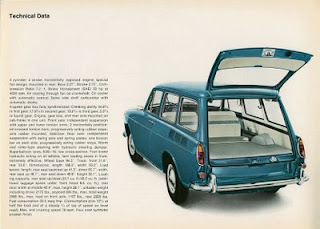
I like this layout and I feel that it is suitable for my project due to the colour scheme and the contents on the page. It caught my eye because I like how the plan and side view line drawing have been used, however, I dislike the layout of this page and the typefaces used.
The design on these cards are simple, crisp and visually eye catching, I feel I could use this style of design along the bottom of my DPS's or on the front cover as it is very modern and I feel it will appeal to my target audience. I also think that I could produce a series of VW Beetles in this way and use it as a timeline with simple text so that it communicates and shows the development of the cars visually and makes it more interesting than large quantities of text.
I like the colour scheme and the style in which the VW Beetle has been produced in, I feel that the layout is slightly dull and the use of experimental typography would make this design more effective and suitable.
I like the simple photography and I feel that I could easily reproduce something similar to this. I like the soft and pastel coloured background as this contrasts strongly against the camper van, I feel that the typeface choice isn't very effective and the leading could be more effective.
- - -
- - -
I love these three series of DPS's as I feel that they are very strong and work with one another really well. I like the background colour choice as it is pale, yet adds an aged feel to it. The imagery ties in well with the overall feel of the layouts and the chosen typeface for the main body of the text. I love the top image and the layout and positioning of the imagery as the sizing creates perspective in the DPS and leads the eye towards the text. I feel the overall finish of these DPS's will and can influence my design and how I choose to present my final outcomes.
I dislike the layout of this image, but I like the aged effect on the green camper van.
This is a layout design that I feel is very successful, I love the use of the white column to split the image, makes it stand out to the eye and how it makes you want to read onto the next DPS. I love the typeface choices as I feel that they are very fresh and successful and work well with the imagery around it. I also like the tight leading and how it is wider in the middle of the block of text and has shorter lines at the top. I feel I could produce some of my DPS's in a similar way to this as it is visually appealing and will work with the style of my look that I want to produce.
I really like this layout as it ties in with the style of how I want to produce mine and I feel the use of the numbers could help to represent a timeline within my design but it allows for it to be clearer and more convenient for the reader.
This is the very style in which I want to produce my DPS's. This image is going to be a strong and main influence because the background is the colour and texture which I want to apply my text, images and layers onto, the grunge and rough appearance of the image itself is the appearance that I want my VW's to have and I love how it connects with the text. I like the chosen typefaces and how they have been arranged in the columns and the leading is very suitable. I think this DPS is going to be the basis of my brochure.


